Header 1 is primarily used as a page title or header.
Header 2 is primarily used as a strong subhead and is styled like this
Header 3 is used as yet another strong subhead and is styled like this
Lorem ipsum dolor sit amet, consectetur adipiscing elit. Vestibulum cursus lacinia fringilla. Donec volutpat porta ligula, ut maximus turpis euismod id. Nam vestibulum congue mi. Sed lectus arcu, pulvinar eget faucibus sed, euismod ut sapien. In in dapibus enim. Aliquam tincidunt vitae sapien in accumsan.
Long-term, durable idsPair your laminating printer with PET/PVC composite cards to withstand the high-heat process. Pair your laminating printer with PET/PVC composite cards to withstand the high-heat process.
All box radius are 15px
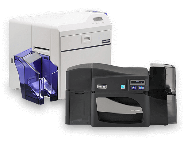
We carry a wide variety of ID card printers for all types of badging needs. Shop yourself after reading through our 7 Step ID Card Printer Buying Guide.
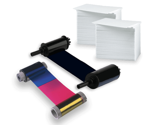
Keep your printers stocked and ready for your print runs! Clear and holographic polyester laminates, retransfer film, ink ribbons, ink cartridges, & PVC card stock.
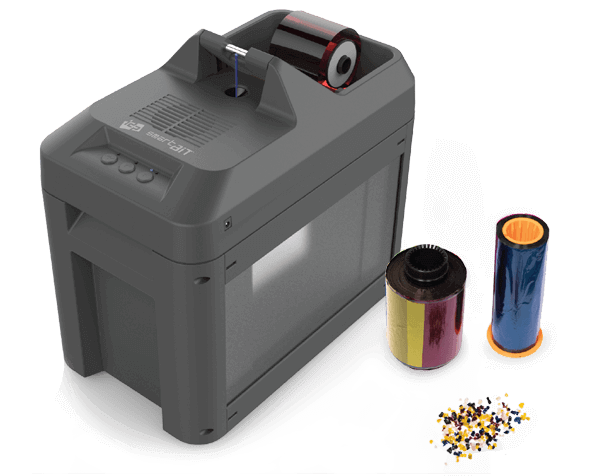
Prevent identity theft by destroying sensitive information found on used ID card ink ribbons and retransfer film. Help your business remain HIPPA and FERPA compliant.


Lorem ipsum dolor sit amet, consectetur adipiscing elit. Ut elit tellus, luctus nec ullamcorper mattis, pulvinar dapibus leo.
Lorem ipsum dolor sit amet, consectetur adipiscing elit. Ut elit tellus, luctus nec ullamcorper mattis, pulvinar dapibus leo.